-
Design
-
Resolution: Fixed
-
 Normal
-
None
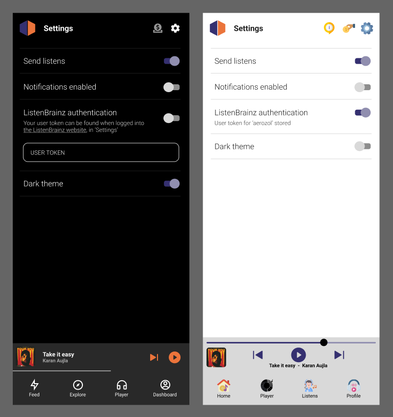
- Change your theme (dark/light)
- Give permission to the app for notification access
- Enter the user token
I was wondering if we should do a minimalistic settings page like the one that the pano scrobbler app has.

[MOBILE-153] Design for an interactive Settings screen
| Resolution | New: Fixed [ 1 ] | |
| Status | Original: Mockup Submitted [ 10209 ] | New: Closed [ 6 ] |
| Status | Original: Mockup Required [ 10208 ] | New: Mockup Submitted [ 10209 ] |
| Status | Original: Open [ 1 ] | New: Mockup Required [ 10208 ] |
| Assignee | Original: Akshat Tiwari [ akshaaatt ] | New: Aerozol [ aerozol ] |
From IRC, akshaaatt: (TODO)
aerozol, the app’s settings section should also direct the user to the documentation doc and jira in order to raise a ticket
Hey akshaaatt, thanks for the feedback.
re. the overall brief, two options:
1. Is the brief for me to deliver a 1:1 mockup of how the settings page will look? In which case, please give me a final list of what you need in the settings page, and what each item does/what interactions are needed.
2. The other option is to not have the mockup be 1:1, and just make sure it has all the different button 'types' that you need. e.g. On/off toggle, dropdown menu, link. Then you can use the designs/styles when you need to.
Other notes, on what should be in the settings page:
A on/off scrobble button is useful for lots of reasons (I have panoscrobbler 'off' atm). But if you won't be implementing that all good, I was just padding out the options page.
I changed the notifications button to not be a toggle, just a button/link (would open the phone notification settings). I think it would be useful, but up to you.
The dollar icon isn't new for this, but I've taken it out. Instead I've moved it to the bottom of the settings page, together with some other 'about' stuff. What do you think?
Prompting the user at the beginning of the app - this sounds like a new brief, rather than part of a settings screen mockup. Can you be specific about what you need?
I don't understand why notifications and send listens would be the same by the way. For me 'notifications' = whether or not I want to let things pop up on my phone. If disabling notifications does something else here maybe we should add some small text under the button like 'needs to be enabled for to submit listens'.
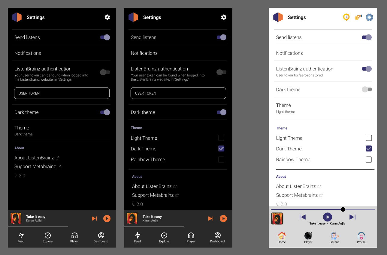
Updated mockup
This assumes we're going for brief option 2. above (e.g. still includes a bunch of stuff that you may not include, so that you have the design parts there if you need them)
New:
- 'about' section at the bottom + subsection headers in purple.
- checkbox design for when there are more than two options for a setting
- hyperlinks to websites indicated with icon

| Attachment | New: settings page-02.png [ 15509 ] |
From IRC, akshaaatt:
We don't need the user token anymore, hence the Auth section can be removed.
Notifications enabled is a bit tricky. Think of it this way, Send Listens and Notifications allow should be the same
Or are we giving the user the functionality to keep submitting listens as optional? We'll have to add checks everywhere then. We are already working on building logic to make queues and stuff. Also, since it is a core feature for the LB app, it makes less sense to keep it optional
It made sense when things were on the MB app, but for the LB app, scrobbling should be a must
Also, the dollar icon you added doesn't seem to fit well for an open source org. Could it be a bit more subtle?
Also, the notifications setting is a 1 time thing. It's not something toggeable. Try it out in the app currently
I would not want it in the settings page altogether. Rather, just prompt the user to give the permission at the beginning of the app. If they don't want the scrobbling, we show them 2 dialogs that Rethink, are you sure, etc and only then if they disallow, add some notification saying "Turn on notifications to start submitting listens". Just to be clear, the notifications option is not a toggle because it opens the phone settings
| Assignee | Original: Aerozol [ aerozol ] | New: Akshat Tiwari [ akshaaatt ] |
Settings page looks nice