-
Design
-
Resolution: Unresolved
-
 Normal
-
None
-
None
-
None
Hello,
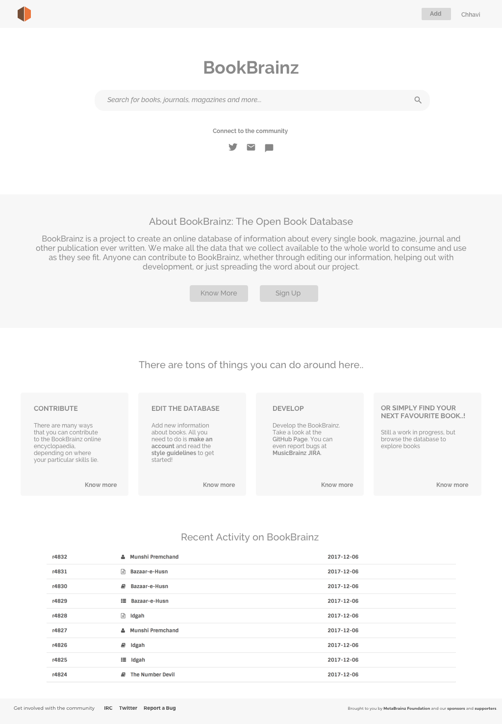
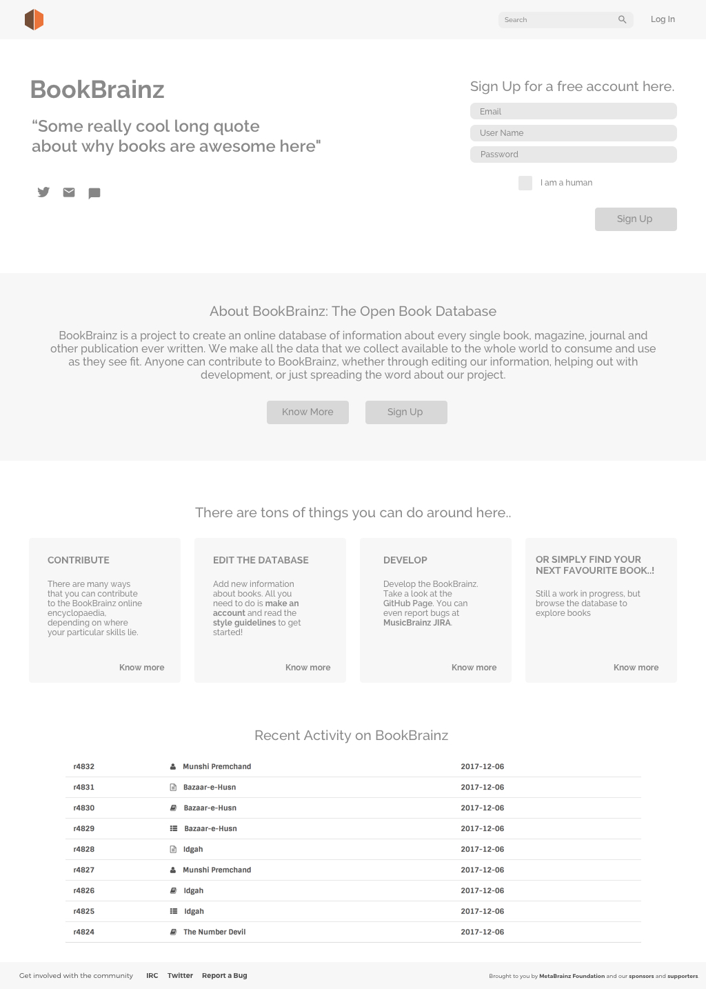
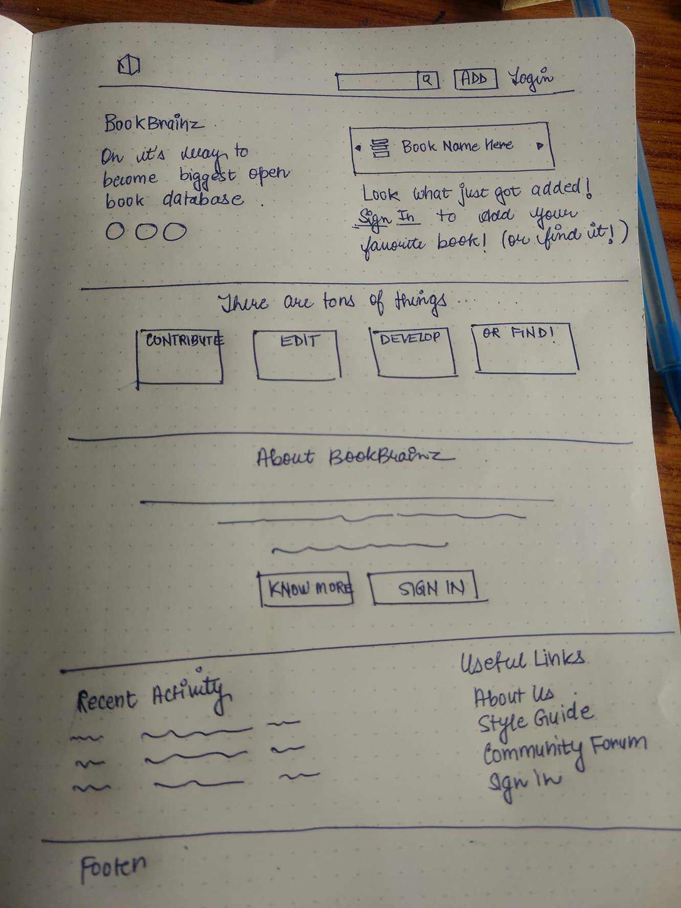
I did a few wireframes for the BookBrainz landing/home page. Please mind these are wireframes...they are done to decide "what goes where". Quicker to do than full-fledged mockups. Once we finalize the "Skeleton", we can go ahead and add colors, alignments, etc.
The suggested redesign is along the lines of what we might follow for other Brainz as well. One is for when the user is logged in, other is for a new visitor. Rest all is pretty self-explanatory I guess...we can discuss these ![]()
[BB-231] Redesign of "Landing Page"
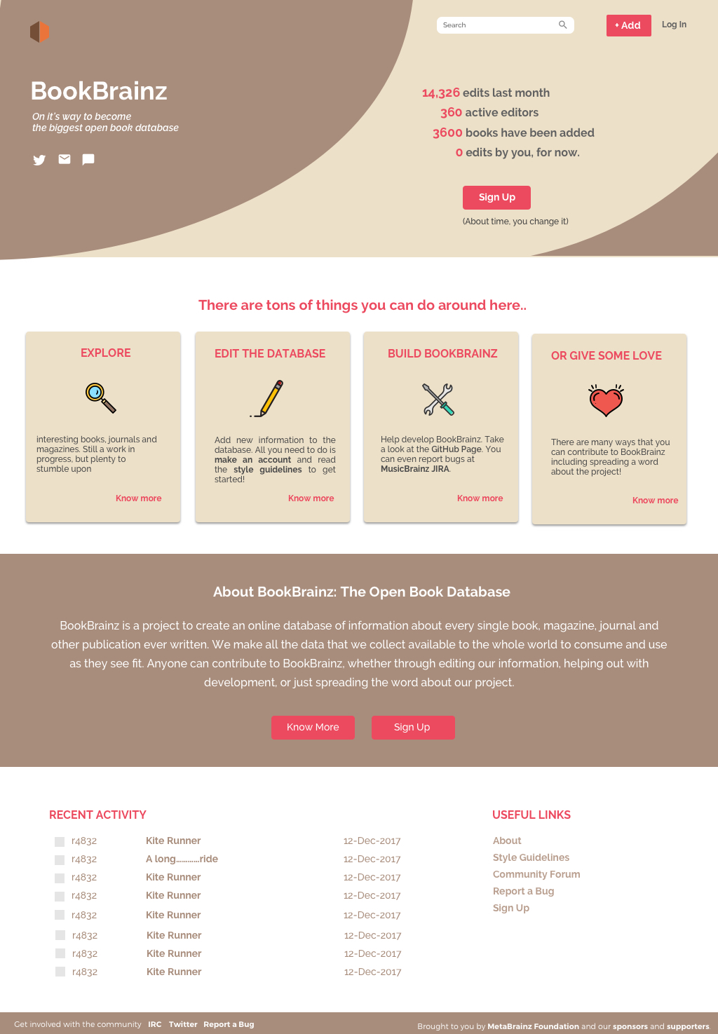
Hello ![]() I am sorry for the delay in updating this. It took me a long time to come up with a new personality for BookBrainz using colours. Things to note.
I am sorry for the delay in updating this. It took me a long time to come up with a new personality for BookBrainz using colours. Things to note.
1. Tried breaking the monotony of two much text
2. Make it look "moving" from the very start ![]()
3. Have a really strong cue/motivation (0 edits by you) to sign up!
(Please don't mind the numbers, they are arbitrary as of now. But they will update real-time, hope that is possible)
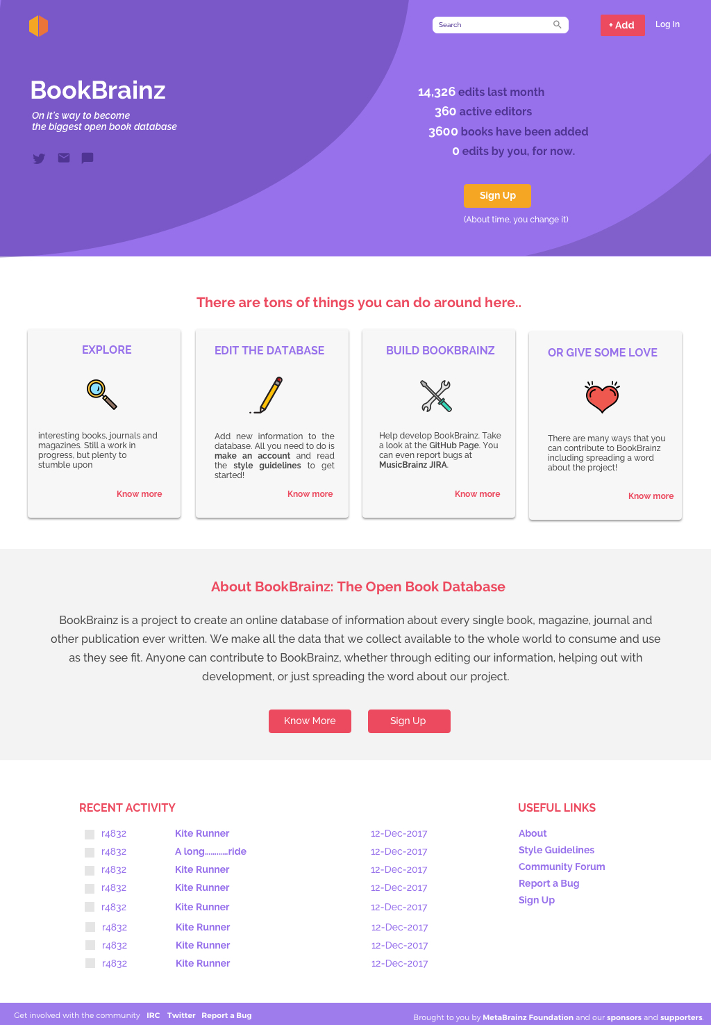
I worked on two versions.
1. First is sticking with our theme presently.

2. Second, is a little more "peppy" so to say.
I was told you guys don't have an idea about what you would like. Hopefully, this helps in visualizing a more concrete form of what we would like in the end. Let me know your thoughts on this. -C ![]()
I like this direction. If we could keep the boxes for contributing fairly small with "Read More..." links, this would be a very solid design in my mind. That way, we keep the explanations visible without too much scrolling, provide ways to contribute right away, and show some activity right on the main page.
As for not reflecting well when the recently added things are low quality, I'm not too concerned about that. Any user database is bound to have that, and if people want to improve it, that's something they can do right away as well. It is a risk, but I think it's also an opportunity to draw people in.
Hi,
Based on your feedback, here are a few changes I can suggest
1. I really like the idea to highlight "it's moving". So on the right, instead of sign in, which we cannot as of now, we can replace it with dynamic recent activity. And a link to sign in. It can show 4-5 recent entries at an interval of 2 secs or so.
My concern here, what if the recent activity is some random entry/test entry. That won't reflect well!
2. Moving the "things you can do" above "about. Same reason as above.
3. Adding a section of useful links at last.
4. Adding an "ADD" button even if they are not signed in. It will prompt a message to sign in if a new user clicks on it.
Let me know what you think! -C ![]()
I like the structure of this, and I'm glad to hear it will be more in line with the other Brainz projects as well! A few initial comments.
1. Until single sign-on is better defined, there's not really a way for a user to register a new account within BookBrainz. They have to go to MusicBrainz, create an account, and then sign in to it via BookBrainz.
2. Something I've been struggling with a bit is showing recent edits more prominently. Having them down at the bottom of the page makes the page fairly static until you scroll. We do want to present information about ourselves prominently for people new to the site, but I think it also helps to have some sense that BookBrainz is "moving", that edits are being made and people are using it. Discogs does an alright job of this, presenting both some branding and idea of what the site is about while still showing activity.
3. On this page, at least, I'd like to make the Add button more prominent as well, rather than being primarily in the toolbar. Our lifeblood will be users who add to and edit the database, so we want to draw people right into that.
First one looks like decent one maintaining the older and pure version of it.
And can I know when it will be starting for the development of the pages?