Uploaded image for project: 'BookBrainz'
  1. BookBrainz
  2. BB-421

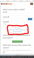
buttons such as aliasButton , IdentifierButton looks like naively built , it is not at all intuitive to all users .

    • Icon: Improvement Improvement
    • Resolution: Unresolved
    • Icon: Normal Normal
    • None
    • None
    • Style
    • None

      In" AddEdition"  , "AddBook",  "AddWork" section There are three Buttons namely 

      1.AliasButton

      2.IdentifierButton

      3.Add Disambiguation button 

      All of them shows no meaning to what they do !.

      shouldn't it be like Green colored buttons signifying active-buttons as it is there with other buttons below it in same page.
            frappe28 frappe28
            endurance21 Divyanshu Raj
            Votes:
            0 Vote for this issue
            Watchers:
            2 Start watching this issue

              Created:
              Updated:

                Version Package