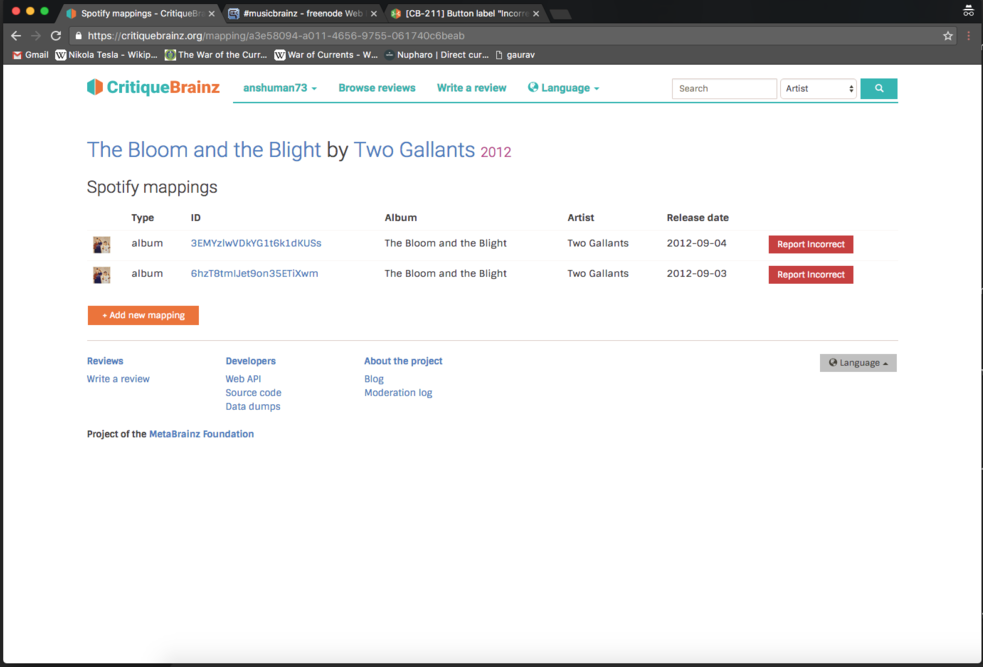
It looks like a label, not a button. I would find this less confusing if either or both:
- The label read "Report Incorrect" instead.
- The button used standard web cues to look more like a button (a raised box effect would probably look best considering the current design).