-
Improvement
-
Resolution: Unresolved
-
 Normal
-
None
-
None
-
None
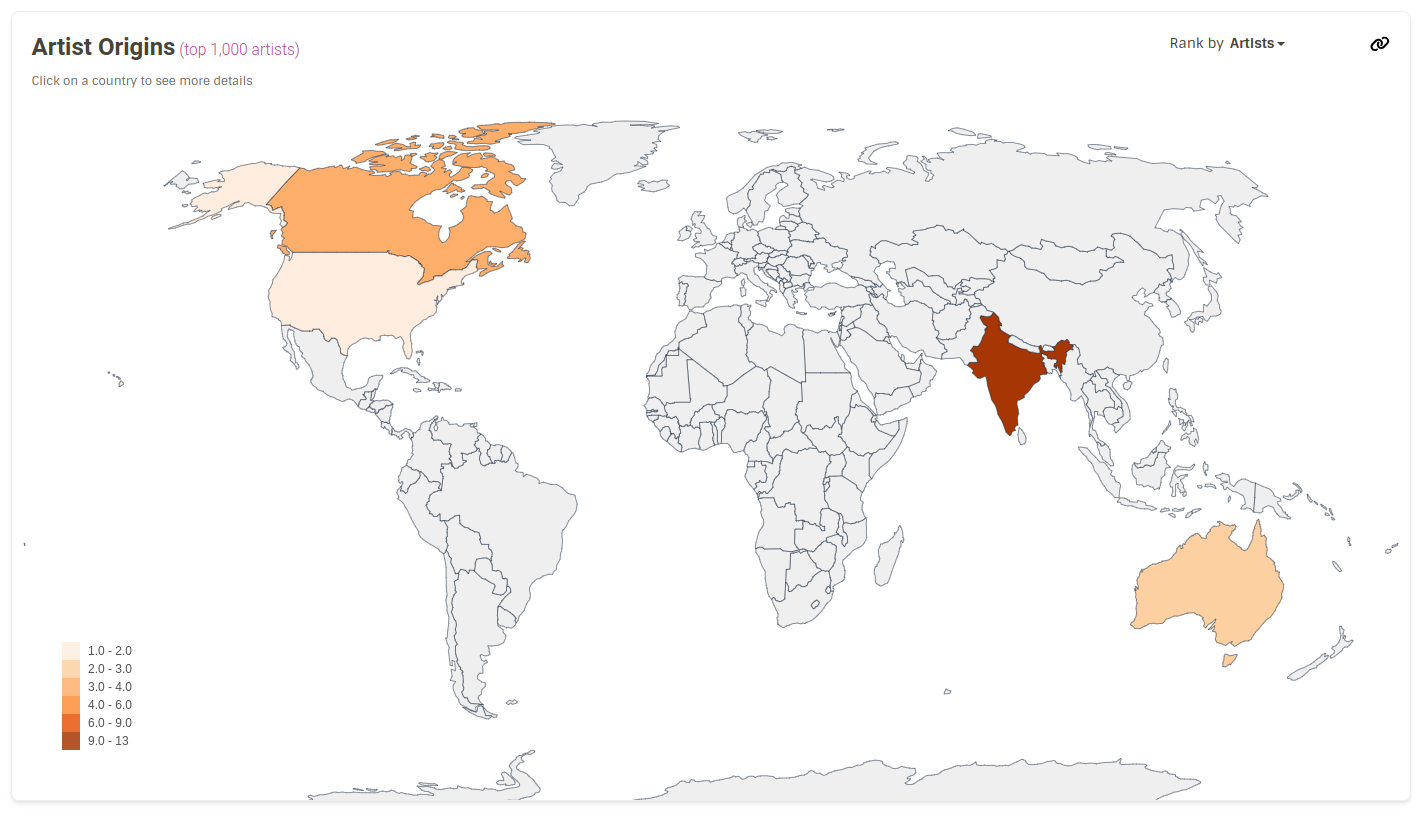
The artist origin map is one of our most popular unique features, and it deserves some filing of the few rough edges it still has! (in my opinion).
Simple-ish display changes:
- It only calculates the top 1,000 artists, which is a frequent source of confusion. I think this should be mentioned up top, perhaps even in the title. e.g. "Artist Origins (top 1,000 artists).
- If we don't want to put it up top, every other statistic has a little "how and when are statistics calculated" link under it, except for this one. We could put it into one of those.
- The text "Click on a country to see more details" seems to use a style and colour unlike anything else in LB. We could change the format, but I'm thinking maybe just get rid of it? We don't have a hint like that on any other graph on the page, and they all have click or rollover functions. Or maybe there is a clever way to indicate clicking, that I haven't thought of.
- If we don't get rid of the "Click on a country..." text, can we hide it at a small screen size? It's the only thing in the way of it looking pretty on mobile, where it shifts everything down.