-
Improvement
-
Resolution: Invalid
-
 Normal
-
NGS - Beta 3
-
None
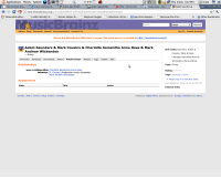
Take a look at http://test.musicbrainz.org/artist/dd3f0918-12ff-4838-b094-0ceee7ebc893/relationships
There's a ton of space to the right, plus vertical space. There really doesn't seem to be the need for
"was a relationship"
" between:"
It'd look a lot better if either the left AR text area was expanded, or (if we have long AR texts) if it were simply layed out like a DT/DD, with the AR text above and to the left of the "DD" items.
