-
Improvement
-
Resolution: Unresolved
-
 Normal
-
None
-
None
-
None
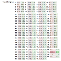
http://test.musicbrainz.org/edit/13876434 is better than what we had in Mason (where that would be in a straight line to the right that went out of the screen and forced scrollong). But it is confusing and not really useful. Could this be shown in two columns? It might be in a way similar to how we currently do with names ( http://test.musicbrainz.org/edit/13876114 ):
Track A oldtimeA newtimeA
Track B oldtimeB newtimeB
... ... ...
Track ![]() oldtime
oldtime![]() newtime
newtime![]()
With "Track Whatever" being bold, old time red, new time green.


