-
Improvement
-
Resolution: Unresolved
-
 Normal
-
None
-
None
-
None
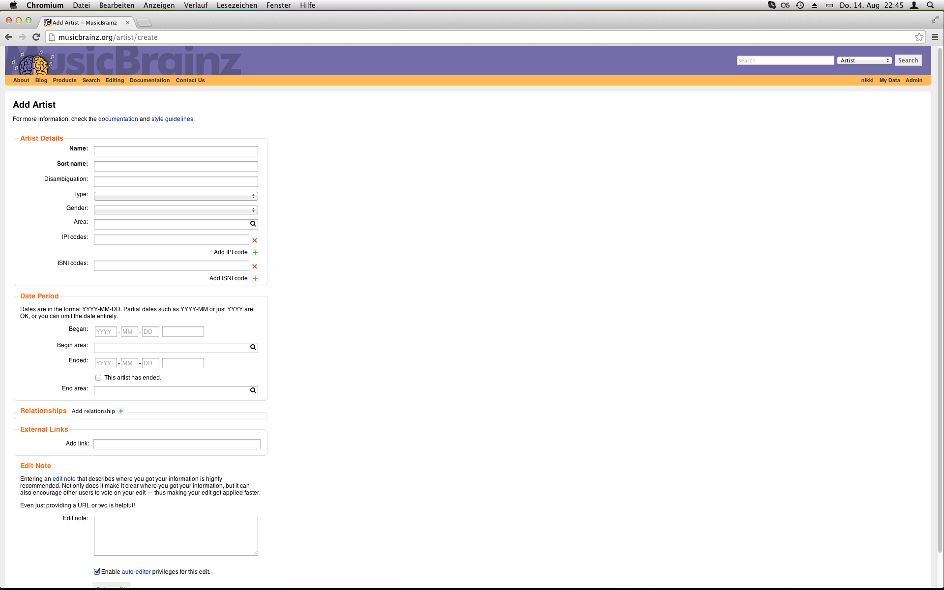
Right now we use bubbles which appear to the right of the field for a variety of things. That means that we have to reserve enough space on the right to be able to display the bubbles, which ends up making the column with all the fields unnecessarily narrow and then on larger screens, the pages need to scroll despite being largely unused space (see screenshot of how it looks for me). If we can replace the bubbles with other less restrictive things which don't need to reserve an entire column on the page, it would make it easier to improve the overall layout of the page because we could be more flexible.
The current things we use them for:
Guess case (name and sortname fields, including aliases)
- We could add a little guess case button to the right of the field (see the one for tracks in the release editor) and a settings button which could open a popup or something (cog icon probably makes sense). The copy button that appears for sortnames could be another button to the right. Putting them inline again would solve the tabbing issue I mentioned a long time ago in
MBS-1554.
Links to selected entities (mostly areas, but also release groups and labels in the release editor)
- We could show the link inline to the right of the field, under the field or implement MBS-4967.
Artist credits (release groups, releases, recordings)
- We could possibly make the artist credits bit hover like when editing tracklists, alternatively use a dialog like for relationships.
Documentation (barcode, annotation, disambiguation in the release editor, ISRC for recordings, ISWC for works)
- We could add a link or button which opens a tooltip sort of thing. We have an appropriate icon already (help.png) but we don't seem to be using it anywhere.
Barcode verification checkbox (release editor)
- We could display this inline in the same way we display the ended checkbox for dates.
Recording associations (release editor)
- We could make it hover like artist credits on the tracklist tab. Alternatively we could use the extra space, make the table wider and embed the selections directly in the table, although exactly how it should look would need thinking about.
External links
- The URL could perhaps show like the linked entities above, or perhaps it could just be an "open" link with an icon, depending on what it's there for. If it's there so that you can see the URL (unlike now, because the field is so narrow), being able to make the field wider should help a lot already. If it's there so that people can open the URL, an "open" link would work fine without needing to display the actual URL. The description could perhaps be a documentation tooltip thing like mentioned for the other documentation stuff, although perhaps we want it to be more visible than that.