-
New Feature
-
Resolution: Unresolved
-
 Normal
-
None
-
None
-
None
Related PICARD-2969
At the moment it is very hard to quickly understand what the merge status is of individual releases, especially when you have say 10+ releases listed in the right/album view.
This is because:
- the match status is only appended as a somewhat cryptic text string appended to the album title
- match statuses are not vertically aligned, so your eyes have to move from left/right for each record and search for that quircky `(12/12; 2?; 1*)` string
- while your brain has to remember what the `?` and `*` mean and what if there are only 3 numbers in the quircky string instead of 4 etc
- and in the docs that quircky string doesn't seem to be explained under Getting Started
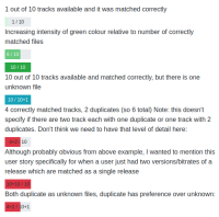
A visually improved UX for the status field could use a progress bar as follows (prototyped using html):

From what I know/see this should also be possible in python using QProgressBar. But to maintain scrolling performance and/or memory usage with 10.000's rows such a progress bar might need to be lazy rendered?
