-
Improvement
-
Resolution: Unresolved
-
 Normal
-
None
-
None
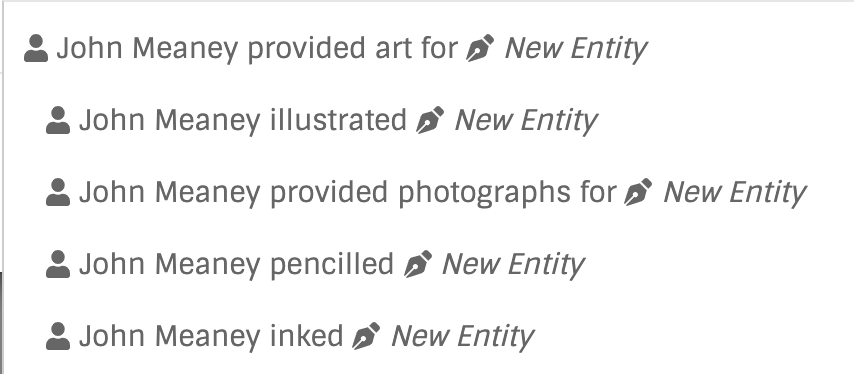
Currently in the relationship search field results the child relationship type have some extra space before them.

parent
child1
child2
A User can misinterpret this hierarchy as css issue, It will be better to use dash instead of space which will look intentional and visualize the hierarchy better.
parent
__child1
__child2
_____grandChild1
__child3
- is related to
-
MBS-12866 Make grouping relationship types more visible in dropdowns
-

- Open
-

(Very) related discussion, and a fontawesome-style icon for testing in BB is here: MBS-12866