-
Improvement
-
Resolution: Unresolved
-
 Normal
-
None
-
None
-
None
from http://bugs.musicbrainz.org/ticket/6008
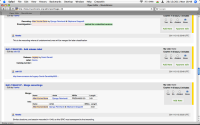
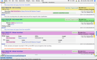
The current layout of the voting page is not good at all for heavy voting (and I suppose that it is also a big turn down for both novice and expert voters).
Some issues and suggested solutions (do these deserve their own bug reports?):
- "No edit notes have been added." wastes spaces. If not notes has been added just do not show the notes space.
- "My vote" is redundant most of the times: I am either voting on subscribed entities (my vote is always "None") or I am reviewing an editor votes (I do not care about my votes). It could be replaced by some graphical decoration near the ballot boxes: underline my vote, show the box with a different background.
- Most of the notes are only one sentence only yet they consume a lot of vertical space because they need to show the editor's name on line by itself (leaving 80% of that line blank) and the actual note on another line (leaving 60% of this other line blank). In-line notes so that they read "EditorFoo: blah blah (2011-12-23)" instead of "EditorFoo" on a line and "blah blah" on another line.
- "Add note" buttons takes a lot of vertical space. Turn "Add note" into a simple link with no button-like decoration and put it where the notes are.
- "Approve edit" buttons takes a lot of vertical space. Make "Approve edit" a normal choice like Yes/no/abstain. This may require a bit of code changes, but there was a GreaseMonkey extension for classic MB that did exactly this.

