-
Sub-task
-
Resolution: Fixed
-
 Normal
-
None
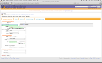
See attached image.
There's several things wrong here:
- The length of the label for the release group causes the input to wrap onto the next line.
- The input wrapping onto the next line causes the help bubble to appear in the wrong place.
- The length of the text for the type field wraps onto the next line but is not aligned properly. The next line should start at the same place as "Um", not right against the left side.
Ideally, the left column should just adjust its width so that the labels and inputs fit. It looks utterly ridiculous having a fixed-width column that's so narrow it causes things to wrap when there's more than enough space available to display everything.
