-
Improvement
-
Resolution: Unresolved
-
 Normal
-
None
-
None
Right now the release editor has an annotation field, but the textarea is so small that it's really not very useful as a way to edit annotations. It's also missing various things like preview and formatting help that are found on the standalone annotation editing page.
I think we should move the main editing field to either a bubble (like artist credits) or a dialog (like the track parser). This would give us enough space for a decent sized textarea and would also give us somewhere to put the changelog field, the formatting help and a preview button.
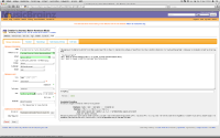
I've attached an example of what it could look like as a bubble.
