-
Improvement
-
Resolution: Unresolved
-
 Normal
-
None
-
None
-
None
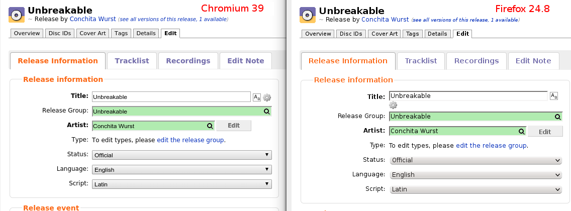
We currently use absolute pixel numbers for several interface elements, which doesn't scale well across devices with different resolutions and window/screen sizes. Manually adjusting these values is inflexible and sometimes leads to unwanted rendering differences, see the attached images. There, div.half-width class is hardcoded to always have a width of 540px, despite what the name suggests.
In MBS-7810, nikki complains that a div.half-width column is unnecessarily narrow on her screen, though I disagree with her suggested solution. On the other hand, in MBS-7932, the same class is too wide for a dialog window that also has a fixed size.
We can't solve both of them just by setting a fix width for the class, which leaves us with these options:
- Use relative units to define element size, such as percent or em. Avoid absolute units, such as pixels, wherever possible.
- Use CSS media queries to define separate styles for different devices and window/screen sizes