-
Improvement
-
Resolution: Fixed
-
 Normal
-
None
-
None
Nobody uses data quality. I'm convinced at least partially that's because you can only see it when you're looking at the release page... and by then, you can already basically see how good or bad it is. I really want a simple way to see what I have properly cleaned up and what I still need to fix when looking at a composer('s release list), and it seems like data quality would be a reasonable fit for this... if only I could actually see it!
So, I would like us to display a small happy face (or something else that suggests high quality) by the HQ releases, and a sad face (or something else that suggests low quality) by the LQ ones. Just the release lists for labels and artists might be a start, or we might want to also show them on search results. I guess we could also do so that if every release in a RG is HQ or LQ, the icon is shown in the overview.


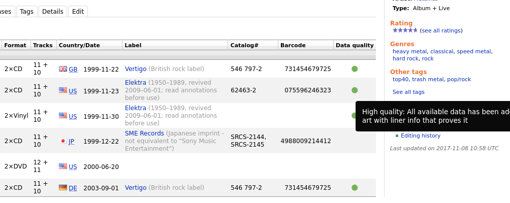

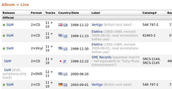
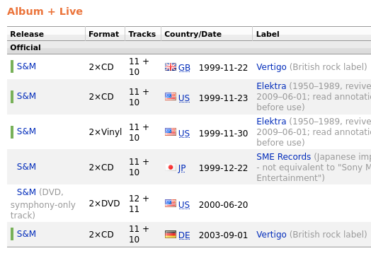


[MBS-8625] Add data quality icons
I prefer bars too rather than circles. A green/red/yellow/grey circle, thanks to all messengers who staked the idea, is currently associated with a user online status (you see it everywhere, Skype, Discord, Slack, Telegram, Jabber, etc).
Here is a full example:
- In a release group: https://test.musicbrainz.org/release-group/29a9ec3b-a9f6-45a7-89fc-ef5cdcbdac3b
- As a release relationship: https://test.musicbrainz.org/release/2a6049d7-98ce-4014-9d81-0655644b5b2f
For some reason in my browser those icons are displayed as blank rectangles. I'm using Brave browser on Debian.
 |
But why are the symbols shown left of "AllMusic" / "Discogs" etc. then?
Because those are images ???
anyway I prefer bars, but I'd like either coloured ❚ (U+275A) (or ❙ (U+2759)) or images
But why are the symbols shown left of "AllMusic" / "Discogs" etc. then?
Maybe we could make it a personal user setting allowing to switch from stripes to unicode circles.
hi! ok first: I actually think perhaps bars are better than dots too!
But we need to reconsider unicode vs images:
I know I said I like the idea (and I did, back when I thought it was something like ⬤ (U+2B24 with an added font color=green or similar)
Because this is what it looks like for me : 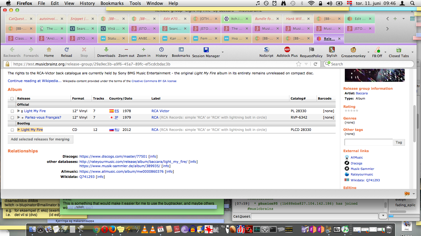
And this isn't even just because of ancient browsers, this is because I do not have colour "image-like" emoji font, something I'll refrain from for as long as possible since it bothers me very much to have images in the middle of text (while black/white "font-like" emojis do not)
Here works for me, I just won't argue unless I really hate what y'all pick ![]() We might merge what is there soon, and then we can put it on beta and make incremental changes according to what people feel while actually testing it for real
We might merge what is there soon, and then we can put it on beta and make incremental changes according to what people feel while actually testing it for real ![]()
@reosarevok: ok. where should we continue the discussion about where and what icon?
Ok, we could bikeshed this forever, so I'm going to just drop off the discussion on where to put it and with what icon. Anything at all we do will be better than the current situation anyway, so people who care more can choose.
+1 for using stripes rather than circles.
Also, is Chhavi still involved in the project? Did anything ever come of MBS-9842: Create data quality icons?
Maybe could be used for “high quality” and
  for “low quality”?
These icons are taken from the same Android Icon Pack as the current video icon. Sun (clean) and cloud (vague) are two opposites, these cannot be mistaken with user’s ratings, and there’s little chance of using weather symbols for anything else in MusicBrainz.